Product Review: Evernote
I haven’t reviewed a product in quite some time. Now that many of us, myself included, are undergoing a period of forced solitude and reflection, it seems like a good opportunity to test out some productivity products that I have been meaning to explore. I’ll start this series by brushing the dust off a product that I had experimented with many years ago—Evernote.
Evernote bills itself as an extension of your brain. For a devotee of the getting things done methodology, this is the trusted capture system par excellence. The goal of this product is to serve as a repository where you can document anything from an outline for a paper to your grocery list. The theory behind getting things done—and Evernote—is that documenting the mundane will help you build connections between interrelated topics. These flashes of insight will lead to new ideas. Evernote is a fervent believer in the getting things done gospel. They evangelize themselves as having “launched [a] digital personal productivity movement.” Their product touts itself as a mechanism for prioritization and optimization. This productivity nerd had to learn more.
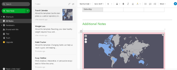
The Evernote web interface is friendly yet professional. When you first log in, you have the option of selecting your primary product usage—whether school, work, or personal. Upon selecting personal use, the launch page appeared. This page, along with its accompanying tool tips, was inviting, without being too intrusive. I appreciated the friendly suggestions on templates to explore and was impressed with the variety of potential options. Personal favorites included the habit tracker, which uses the Jerry Seinfeld method to prevent you from breaking the chain when cultivating a new habit.
I also thought the essay outline template would be useful for team storyboarding exercises, although I’m not so sure about the font choices used.
The more I explored Evernote, the more I came to appreciate it. I had remembered it as a regular old note taking app when I first stumbled upon it years ago, but it’s since come a long way. Below are some of the features that I liked best:
The ability to add notes to the favorites menu. Note taking apps can get cluttered quickly, so this is essential to keep critical content front and center.
The web clipper extension, akin to the Pinterest “pin it” tool, is a useful way to aggregate information from across the Internet for inclusion in Evernote’s capture system. I wish Trello, one of my favorite productivity products, featured a similar extension.
The ability to upload attachments. On the travel calendar template, I included a map of the countries I’ve visited to date. This was welcome inspiration for a future free from travel planning restrictions.
I liked that the free version gives you the option of syncing across two devices. This way, I could use the web version and also download the mobile app so that I could browse content and aggregate ideas without being chained to my desk. This is an essential characteristic of a solid capture system.
The ability to share notes with other people, even on the personal version of the product, was an unexpected bonus.
There were a couple aspects of the product, though, that gave me pause.
While diligently browsing the various templates, I was a bit disturbed to come upon Evernote’s weight loss template. I don’t have any issues with tracking health and fitness—far from it. The template that Evernote created, however, has a placeholder for tracking a daily weight change. This is unnecessary and promotes an unhealthy relationship with food and exercise. I’d urge Evernote to reconsider the design of the template in light of the potentially negative impacts this could have.
I’m old school, so I always check to see if something can be formatted to print. Blame it on my years of consulting training. I’m sure few people would have checked for this, but the format to print view in Evernote was decidedly unfriendly. Tables breaking across the page? Ugly URLs in the footer? Inexcusable. Evernote needs to take another look at this format for those who may decide to take portions of a digital product analog.
While I didn’t appreciate Evernote in the past, I can see now why people likethe concept of a virtual notebook. My personal aversion to clutter means that I prefer a productivity product with a cleaner interface, such as a Kanban board, which can hide information from digital view. For those who like aggregating information more than I do, Evernote’s clean and slick interface keeps things organized, and the search functionality helps users keep on top of the details. I’d warmly recommend Evernote as a sound personal productivity system.


